Relaxed Curls Style Hair for Genesis 9
March 14, 2024
Z Subtle Model Expressions for Genesis 9
March 15, 2024
Description:
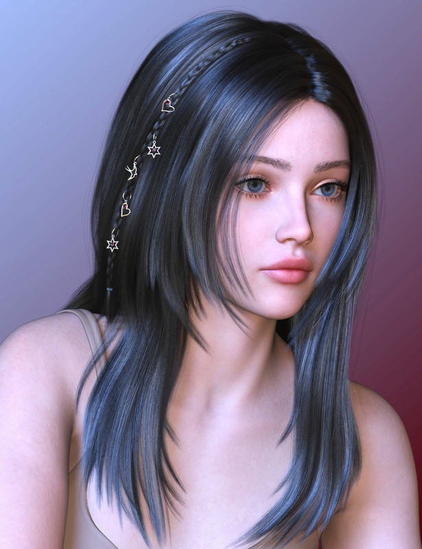
Mneme Hair is a stunning, classic, parted-in-the-middle, hairstyle. To add some bohemian flair, an optional braid is included as a separate part, in two versions, simple and adorned with tiny rings.
This unique and captivating style combines sophisticated beauty with a playful touch.
Includes: 26 adjust, 22 movement, 54 styling, 14 volume 28 windy morphs, 6 braid morphs, 15 style presets, 36 normal material presets, 3 shine options, 36 partial material presets for the fringes, 36 partial presets for streaks and 18 material presets for rings and braid tie.
Add this versatile hairstyle to your library today and have fun creating impressive artwork!
Link:
https://www.daz3d.com/mneme-hair-for-genesis-9


I know you like to play around with formatting every now and then but this new layout is really difficult to navigate.
I’m actually having big performance problems, I’m trying to keep everything as light as possible, honestly I never like to reset everything, but I had to because it was too slow… The current theme is the one from months ago.
I’m sure you are on it already, but to save you some headache, for a quick fix to the layout you can use this, just append it in your “betheme” panel, last menu option called “Custom CSS and JS”.
.portfolio_group.masonry-hover .portfolio-item .masonry-hover-wrapper .hover-desc,
.masonry.tiles .post-item .post-desc-wrapper .post-desc .post-title:after,
.masonry.tiles .post-item.no-img, .masonry.tiles .post-item.format-quote,
.blog-teaser li .desc-wrapper .desc .post-title:after,
.blog-teaser li.no-img,
.blog-teaser li.format-quote {
  background: #161616;
  position: relative !important;
}';
article.post.post-item {
  height: 380px;
}
I don’t mind how the web looks as i always override it with my custom style with Tempermonkey, so as long as the content is there… me happy 🙂
Pro tip: I recommend you to always use a “child-theme”, easier to modify and mess around with, and less trouble when updating or migrating as its not gonna override your changes.
Thanks for your work btw.
Correction to my previous post (i can’t edit as you have disabled comment edits it seems, or the time limit for edit is set to something really low)
After the first bracket close i forgot to delete a ” ‘; ” which is a remnant from the copy&paste from my JS file in tempermonkey sry 😛
So this css file should be correct the floating of the posts? the edit time is 24 hours
Thank you so much this is really good! 😉
😉👍🏻
Sorry maybe I jumped the gun, when the images were all different sizes. with the images all the same size today, it’s much easier to flow with what has been posted, I should just sit tight and shut my pie hole. Sorry sorry 🙂
Ahahaha, don’t worry! I just mean that when I reset the website, there’s a specific reason for it. It’s either to try to improve its performance or because there are actual performance issues. And often since I’m the only one managing the website and I’m not even an IT expert, I find myself having to struggle quite a bit to get it working properly again. 🙂
New site worse than old site 🙁
Why? Things aren’t lined up. Everything is like an inch too high or too low, I can’t simply read each row. Instead I have to read along like a weird diagonal as the height of each item/image/preview isn’t equal/even.
I still have to fix it better, but this is surely due to the fact that the preview images were automatically cut, so it uses the masonry style, which allows the original images to be used without being cut, in this way the original aspect ratio is maintained…
you fixed it ! hooray
Welcome back!!
new version looks better, i like it.
can you add dark mode too
I did liked the style now. It doesn’t have empty spaces. I’m having no trouble browsing whatsoever.
I really like the new design. It would be awesome if it were possible to have a choice to have more items on each page.
Since we are on the topic, I like the new layout. Clean, to the point, easy to follow.
The only thing that I find a little weird is the fact that we need to click the post’s name to open it from the front page. If we could click the images instead (or “as well”), would be awesome.
But that is me being annoying, it works as is lol.
Welcome back, i’ll try to buy you a coffee later this month. You deserve it! 😉
This site is useless. Every time I click on a download link (Mega or Google Drive), it always directs me to an url named https://ouo.io.